SiriusXM Fall 2019 Internship Project
Under the guidance of the User Experience team at SiriusXM, I redesigned the visual elements on their website’s “Learn More” page—a page users are sent to read about their trial subscription.
Tools:
Sketch
AfterEffects
Sketch
AfterEffects


*disclaimer: The intention of the project was to test two of my prototypes against the current page and then to present the design to the page’s stakeholder. However, we were unable to get to that point due to the limited duration of my internship. The page has since been redesigned.
Research & Wireframing
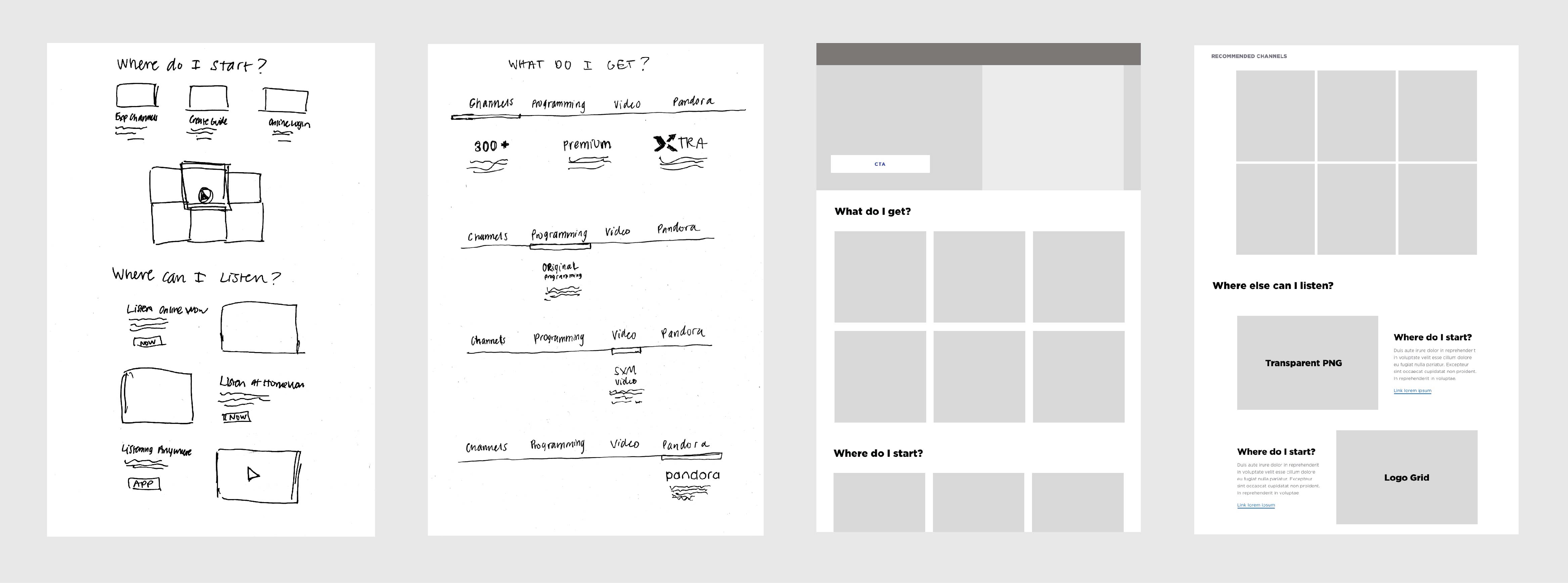
I started my project with competetive research and analysis of wepages that have similar multi-module offer description pages.
After gaining a better understanding of what a page like this should look like, I worked on building wireframes using basic units from the atomic design system the UX team had built.

Prototyping
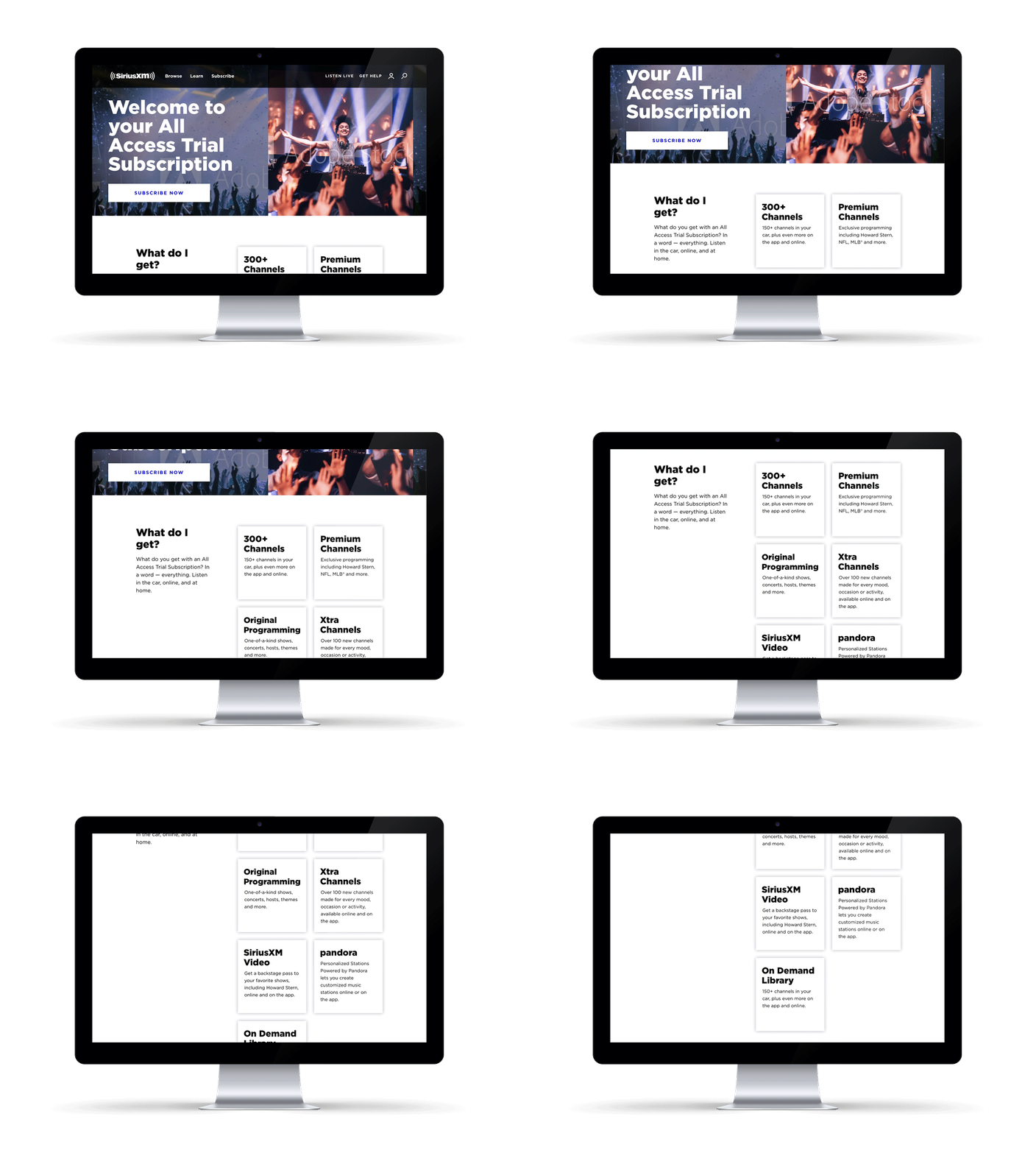
Please, get rid of the bubbles! This was the focal point of the Learn More page redesign, so I took that as a starting place and prototyped several new box-shaped modules. Ultimately, the simple box with a floating drop shadow was chosen as it fit in best with the assets in the established design library.
Please, get rid of the bubbles! This was the focal point of the Learn More page redesign, so I took that as a starting place and prototyped several new box-shaped modules. Ultimately, the simple box with a floating drop shadow was chosen as it fit in best with the assets in the established design library.

Testing
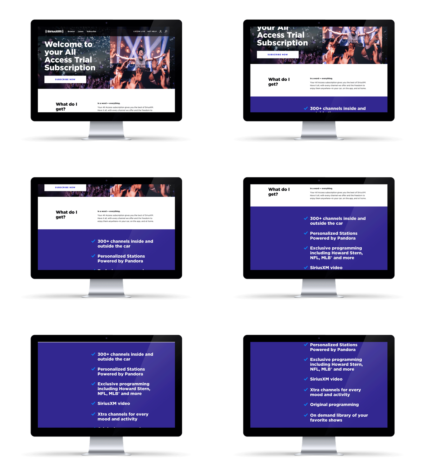
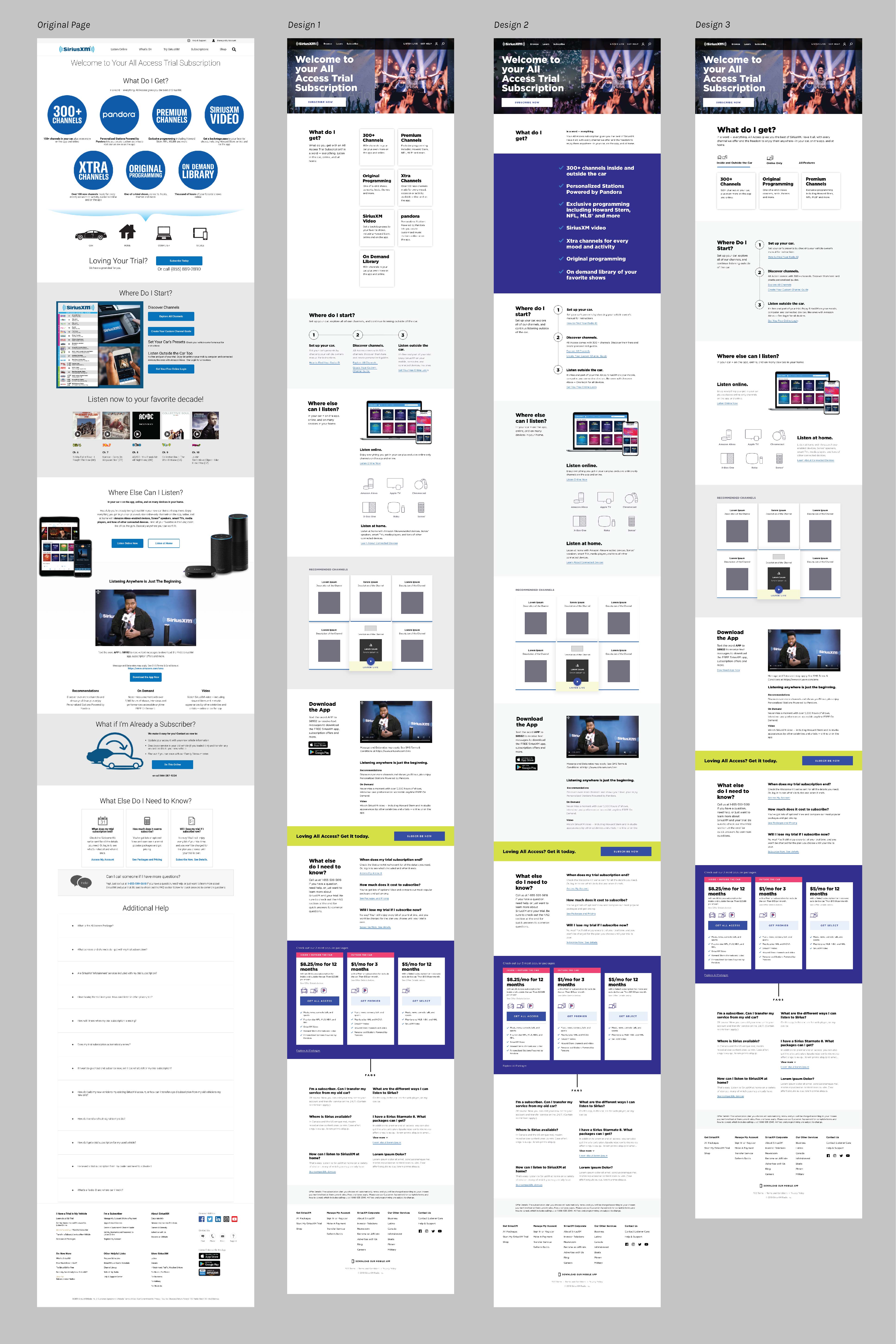
I ended up with three prototypes intended for testing against the original page design.

Other assets further down the page were also included in the redesign and test prototypes. I used the established design system as a guide to make a few variations. Below are the full screen scroll lengths for comparison.

Back to Top ︎︎︎ ︎︎︎ Previous Next ︎︎︎